Analytics
The Analytics page shows how your alerting is performing over time — delivery, response, and channel effectiveness across all your incidents. Use it to spot which channels reach people, how quickly recipients respond, and which departments are slow to acknowledge.
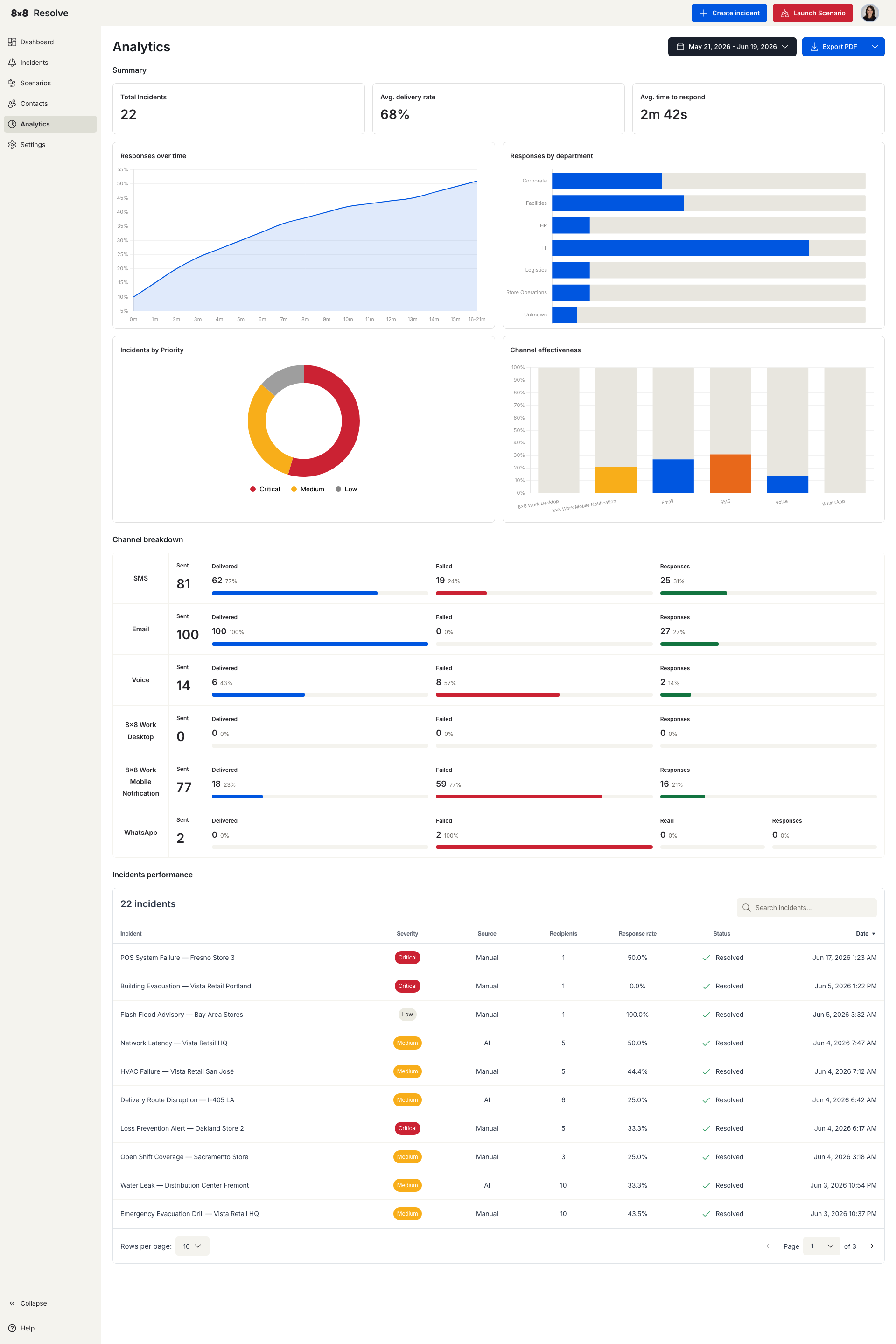
Pick a date range at the top right to scope every metric, chart, and table on the page. Use Export to download the current view — choose PDF for a formatted report or CSV for the underlying data.
Key metrics
The top of the page summarises performance across the selected period:
| Metric | What it measures |
|---|---|
| Total Incidents | Number of incidents sent in the period. |
| Avg. delivery rate | Average percentage of messages successfully delivered to recipients. |
| Avg. time to respond | Average time between an incident being sent and a recipient responding. |
Charts
| Chart | What it shows |
|---|---|
| Responses over time | Response volume across the period, so you can see trends and spikes. |
| Responses by department | How responsiveness breaks down across departments. |
| Incidents by Priority | The split of incidents by severity (Critical, Medium, Low). |
| Channel effectiveness | A channel-by-channel Channel breakdown of Sent, Delivered, Failed, Responses, and Read counts across SMS, Email, Voice, 8x8 Work Desktop, 8x8 Work Mobile Notification, and WhatsApp — use it to compare how each channel performs. |
Incidents performance
Below the charts, the Incidents performance table lists each incident with its key outcomes:
| Column | Description |
|---|---|
| Incident | The incident title and when it was sent. |
| Severity | Critical, Medium, or Low. |
| Source | Manual or Automation. |
| Recipients | Number of people targeted. |
| Response rate | Percentage of recipients who responded. |
| Status | Active or Resolved. |
| Date | When the incident was created. |