Button theming
Primary and secondary buttons
You can change both the primary and secondary colours on the chat widget, either globally across each of the parts of the widget — invitation/form/window — or configure each one differently.
Legend (default theme): 🔵 blue = primary button · ⚫ black = secondary button
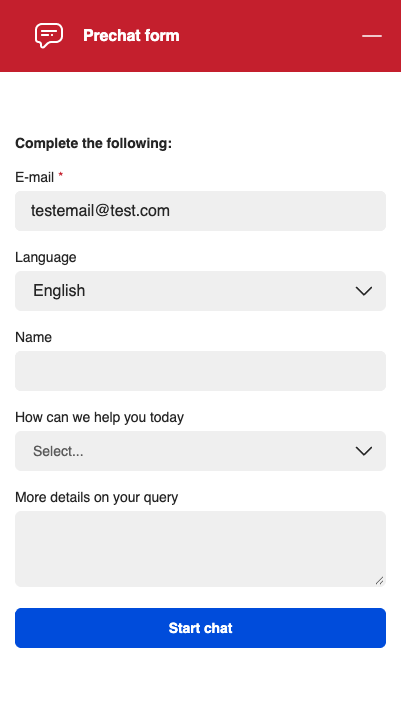
Prechat form
The prechat form uses a primary button for its main call to action, Start chat (🔵).
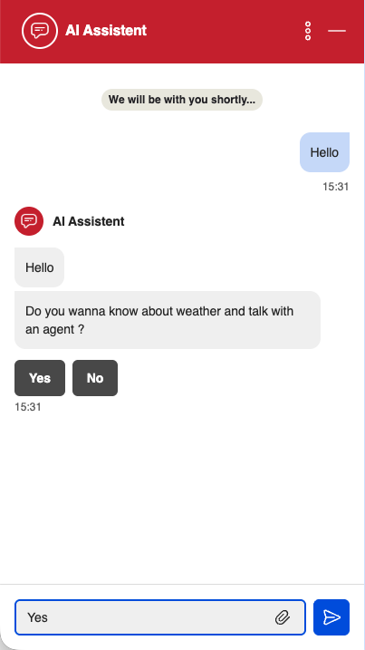
Chat window
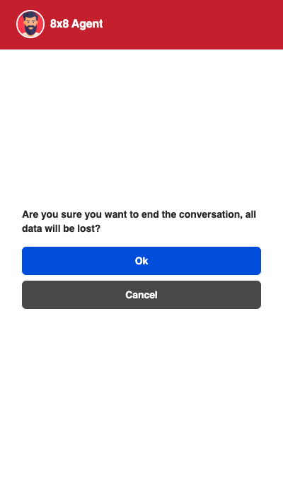
In the chat window you can see both button types. Quick-reply options (here, Yes / No ⚫) and the Cancel action (⚫) are secondary buttons, while the message send action and Ok (🔵) are primary buttons.
Button properties
Below, is the table of configuration that you can use to change the button colours, the chat theme property is what is used to change the colour.
| Chat Theme Property | Example value | Description |
|---|---|---|
| buttonPrimaryTextColor | #FFFFFF | Changes the primary button text colour |
| buttonPrimaryTextColorDisabled | #888888 | Changes the primary button text colour when it's disabled |
| buttonPrimaryBackgroundColor | #000080 | Changes the primary button background colour |
| buttonPrimaryBackgroundColorHover | #00008B | Changes the primary button background colour when it's hover |
| buttonPrimaryBackgroundColorActive | #000099 | Changes the primary button background colour when it's active |
| buttonPrimaryBackgroundColorDisabled | #000066 | Changes the primary button background colour when it's disabled |
| buttonSecondaryTextColor | #FFFFFF | Changes the secondary button text colour |
| buttonSecondaryTextColorDisabled | #888888 | Changes the secondary button text colour when it's disabled |
| buttonSecondaryBackgroundColor | #ADD8E6 | Changes the secondary button background colour |
| buttonSecondaryBackgroundColorHover | #B0E0E6 | Changes the secondary button background colour when it's hover |
| buttonSecondaryBackgroundColorActive | #87CEEB | Changes the secondary button background colour when it's active |
| buttonSecondaryBackgroundColorDisabled | #B0C4DE | Changes the secondary button background colour when it's disabled |
| buttonBorderRadius | 0px | Changes the button rounding |
To apply a theme, add a themeCustom object to the config block of your chat script, using the properties from the table above. The full script then looks like this — note the themeCustom object nested inside config:
    <!-- Place this code snippet anywhere you want the button to appear in your page. If no button has been configured in the chat script, it will not show up nor take any space. -->
    <div id="__8x8-chat-button-container-script_1333070733643e5b8fa7a791.52161248"></div>

    <!-- This script will not interfere with the button layout, you just need to include it in the same page. It must also be within the <body> section of the page, preferably just before the ending tag. -->
    <script type="text/javascript">
    (function(c, f, ef){
        var typeofC = Object.prototype.toString.call(c);
        var props = (typeofC === '[object Object]' && c) || {};
        var cb = f || (typeofC === '[object Function]' && c);
        var config = {
            scriptUuid: "script_1333070733643e5b8fa7a791.52161248",
            tenant: "Y2hyaXNjcm9tYmllZGVtbzAx",
            channelName: "WebChatChannel",
            channelUuid: "Ak3ULjXFQx-unSA6ebdW8A",
            domain: "https://vcc-eu11.8x8.com",
            buttonContainerId: "__8x8-chat-button-container-script_1333070733643e5b8fa7a791.52161248",
            align: "right",
            themeCustom: {
                "buttonPrimaryTextColor": "#FFFFFF",
                "buttonPrimaryTextColorDisabled": "#888888",
                "buttonPrimaryBackgroundColor": "#000080",  // Navy Blue
                "buttonPrimaryBackgroundColorHover": "#00008B",  // Darker Navy Blue
                "buttonPrimaryBackgroundColorActive": "#000099",  // Active Navy Blue
                "buttonPrimaryBackgroundColorDisabled": "#000066",  // Disabled Navy Blue
                "buttonSecondaryTextColor": "#FFFFFF",
                "buttonSecondaryTextColorDisabled": "#888888",
                "buttonSecondaryBackgroundColor": "#ADD8E6",  // Light Blue
                "buttonSecondaryBackgroundColorHover": "#B0E0E6",  // Powder Blue
                "buttonSecondaryBackgroundColorActive": "#87CEEB",  // Sky Blue
                "buttonSecondaryBackgroundColorDisabled": "#B0C4DE",  // Light Steel Blue
                "buttonBorderRadius": "0px",
                "headerBackgroundColor": "blue",  // Header Background Color
            },
        };

        var url = new URL("https://cloud8-cc-geo.8x8.com/vcc-chat-channels/public/webchat/discovery");
        var params = { domain: config.domain, tenant: config.tenant, channelUuid: config.channelUuid };
        url.search = new URLSearchParams(params).toString();
        fetch(url)
            .then(response => response.json())
            .then(data => config.domain = !data.domain ? config.domain : data.domain)
            .catch(error => console.warn('Failed to retrieve override domain, will continue using ', config.domain, error))
            .finally(() => loadChat());

        function loadChat() {
            var se = document.createElement("script");
            se.type = "text/javascript";
            se.async = true;
            se.src = props.loaderURL || (config.domain + "/CHAT/common/js/chatv3.js");
            Object.keys(config).forEach(function (k) { se.dataset[k] = config[k] });
            Object.keys(props).forEach(function (k) { se.dataset[k] = props[k] });
            function handleInitEvent(e) {
                var initFn = e.detail.init;
                initFn(config, cb);
                se.removeEventListener('init', handleInitEvent)
            }
            function handleErrorEvent(e) {
                ef && ef(e);
                se.removeEventListener('customerror', handleErrorEvent);
            }
            se.addEventListener('init', handleInitEvent);
            se.addEventListener('customerror', handleErrorEvent);
            var os = document.getElementsByTagName("script")[0];
            os.parentNode.insertBefore(se, os);
        }
    })(function(chatApp) {
    chatApp.setCustomerInfo({
      "First name": "James",
      "Last name": "Smith",
      "Verified": 'yes',
      "Email address": "james.smith@example.com"
    })
  });
    </script>
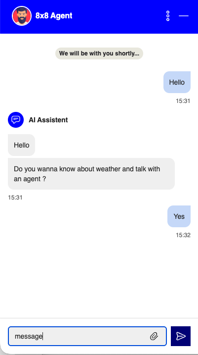
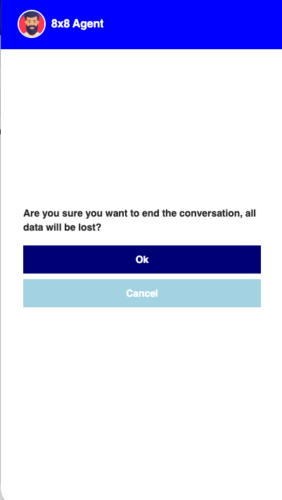
Images with buttons changed
Once applied, the theme properties above change the primary and secondary button colours across the widget. In the examples below the header is set to blue, the primary buttons (send, Ok) use navy blue, and the secondary buttons (Cancel) use light blue.